Google Maps has introduced a very useful new feature to its mobile app called COVID-19 Heatmap.
Announced in a blog post by Sujoy Banerjee, Product Manager for Google Maps, this new map layer allows you to see the 7-day average number of coronavirus infections per 100,000 population and whether it is trending up or down to know if it is trending up or down. The update was released on September 23 and will be available on iOS and Android devices within the next week.
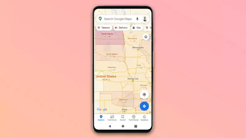
Once the update arrives on your device, you can try out the new layer by tapping the layer icon in the upper right corner of the main app screen, just below the search bar.
Then from the layer menu that pops up, tap "COVID-19 Info."
You will then see a color-coded map and a label with additional information promised by Google. [This map will work at the country level for all 220 countries covered by Google Maps, but will also provide state, county, and city-level data for certain regions. While I'm not likely to be traveling abroad much at the moment, being able to easily track various infection rates in neighboring towns or where friends and family live could prove very useful for those who need to travel locally.
According to Google, these layers of data come from outlets that they already use as reliable sources for COVID-related searches in Google searches. These include newspapers such as the New York Times, institutions such as John Hopkins University and the World Health Organization, and national and local governments.
As Banerjee writes in a blog post, the addition of the COVID-19 information layer will help users "make more informed decisions about where to go and what to do." This is a great addition to Google Maps in terms of helping users deal with the pandemic, along with previous updates that show local eateries where takeout is available and direct them to where to order.


Comments