When I first saw iPadOS 14, I thought I saw a major change in Apple's tablets. While many saw the Magic Keyboard as a step toward making the iPad Pro more like a MacBook, these new software changes further hint at how Apple's hardware is becoming more unified.
These changes feel like a substantial shift that will make the iPadOS fit better with the larger iPad display than before; the Apple Pencil changes will enable new ways to use the iPad, but the refined interface is what I most looking forward to installing the iPadOS beta version.
Not all Apple devices run the same OS, but the company's decision to gradually move to a unified design language is exciting to watch, as Apple made clear when it unveiled its Apple Silicon custom chips, which will be available in the Apple Pencil and Apple Pencil OS, It won't be long before iPhone apps like Monument Valley will be available for the Mac.
It all adds up to a very interesting moment in the Apple ecosystem. The following are the biggest signs that the Mac is penetrating the iPad:
The iPad initially started out with the familiar visual language of the iPhone, with a search field at the top of the screen. But now, the iPad has diverged slightly from the iPhone, taking cues from its closest relative (in size), the Mac.
Now, when you go to search, a gray rectangular field pops up in the middle of the screen, similar to the Spotlight search field that appears when you press Command+Space or click the magnifying glass icon on the menu bar.
And just like macOS, search on the iPad can be used to open apps, look up specific facts, and perform more tricks. Some of these tools, such as the ability to convert measurements or perform mathematical equations, are always shared.
The new search in iPadOS also displays a drop-down list of possible answers, the same as on the Mac.
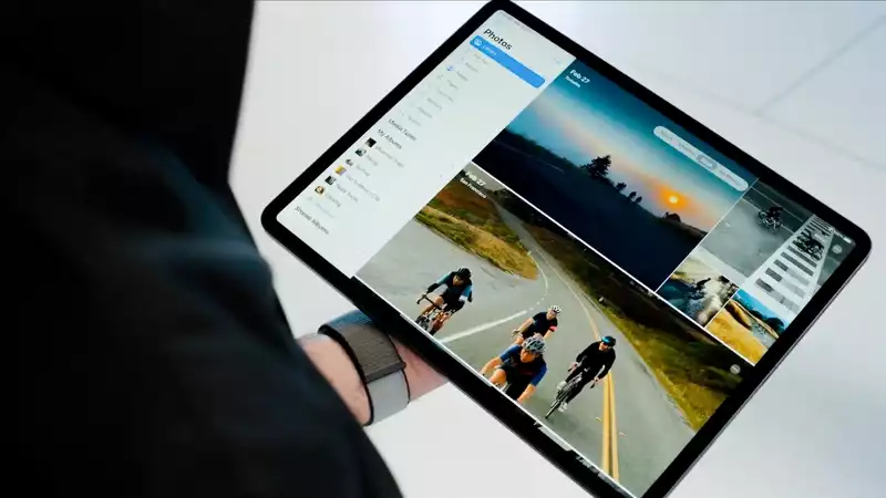
iPadOS adds a left side menu to many Apple applications. This will remind Mac users of how those applications appear on the Mac. This is "Photos," where you can easily jump from different ways of viewing the library.
You start with the overall library where all your photos are, then "For You," "Albums," and all the other menus. It's not groundbreaking, but it looks just fine.
That's because the iPad has abandoned the interface it inherited from the iPhone (these options were tabs at the bottom of the screen) and moved them to the left. This is a smart change because it helps maximize the horizontal space on the iPad screen.
Currently, when a call comes in, the entire iPad screen is occupied. This has changed with iOS 14 and iPadOS 14, both of which have moved to notifications that appear at the top of the screen like a Mac, which is a nice surprise.
The only difference is that these notifications appear at the top center of the screen instead of the top right. This change makes sense. This change makes sense because the phone calls (even though I get more robocalls) are more immediate than regular notifications.
As you can see here, the iPadOS is wise in maximizing the screen area.
All of these changes give us many reasons to believe that Apple is working toward one unified operating system for their devices. This has been rumored and tweeted in the tech media for some time, and as someone who uses iPadOS 14 on an iPad Pro connected to a Magic Keyboard, it is easy for me to see that future becoming a reality.
That said, there is another change that I think Apple apps need to make on the iPad. If certain apps could work seamlessly across Apple devices and maintain work and progress across platforms, it would allow for greater productivity.
It would be great to see the iPadOS become more like macOS. I just wish it had some of the same strengths.


Comments