Sling TV has finally redesigned their app. The app is not yet publicly available, but we tried it out on a Fire TV stick that Sling sent us.
Overall, the new Sling TV looks much cleaner and fresher than before, with larger art and less white space between buttons. The guide and DVR interface have undergone major changes that have been long overdue and are good enough to keep it on the best streaming services list.
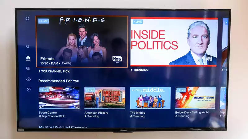
Of course, the biggest change in the new Sling TV app is the new home screen: the "MY TV" screen (a grid of channels, recordings, recommendations, and popular content) is gone, replaced by a screen promoting "Top Channel Picks. In my case, it pulled from TBS and recommended shows that were airing at the time: Friends and American Dad.
Next up are more Top Channel Picks, showing what is airing on popular networks. First is ESPN's "The Jump," followed by CNN's "Newsroom," USA's "Chicago P.D.," TLC's "Return to Amish," and Food Network's "Chopped." In all, there were 15 recommendations in this column, which eventually led me to an episode of South Park.
The most interesting change so far is in the next row, which displays the most watched channels. Of all the sections of the home screen so far, this is probably the best way to find what you might actually want to watch. You will then see content by category (sports, news, shows, movies, kids), recent recordings, and a "continue watching" section. If I were to make any changes here, it would be to move Continue Watching up a bit more, since it's a bit more personalized than Top Channel Picks, but I'm not sure that's the best way to go.
But the biggest change, in my opinion, is the Guide screen. A little heart appears on the left edge of each channel row, making it much easier to mark your favorite channels.
Narrowing down to only selected favorites is easy, because there is a "Favorites" tab at the top. It would be great if I could sort the favorites manually, but the only option available is to have Sling sort them alphabetically." But what if I'm looking at USA more than AMC?" I thought during the test. The guide has other tabs: A-Z, Recents, Sports, News, Movies, and Kids.
This is one of the "obvious changes". Over the past few years, Sling has been catching up with its competitors by integrating DVR capabilities into its systems and expanding available capacity.
So now that DVRs are where they should be on the service, it makes sense for Sling to have a unified DVR section. It is located just below the left rail guide and has a small bar graphic of the capacity being used, followed by the art for each program that was DVR'd.
This is the kind of change I wish they had done without waiting for a major update, but still a welcome one.
User profiles may sound like a service feature rather than an app feature, but the lack of multiple user profiles means that Sling gets more cluttered than necessary. This allows for more personalized recommendations by allowing users to have a more personal DVR and Favorite Channels list.
This is especially annoying for Sling Blue and Sling Orange + Blue subscribers, where they get three or four (respectively) simultaneous streams, but everyone still uses the same DVR and Favorite Channels list.


Comments